Few home improvements deliver as much impact per pound spent as repainting the entrance to your home. A freshly painted front door can transform the entire character of a property in a single weekend, shifting it from forgettable to striking — or from dated to distinguished. Yet with hundreds of shades available and no shortage of opinions, settling on the right colour can feel surprisingly daunting. The good news is that the decision doesn’t need to be guesswork. When you understand a handful of practical principles — from architectural style and brickwork to light conditions and long-term wearability — the perfect colour almost chooses itself.
Kerb appeal, as estate agents never tire of reminding us, starts at the doorstep. Whether you are refreshing your own home or preparing a property for sale, the entrance sets an expectation for everything behind it. Get it right, and your front door becomes a quiet statement of taste. Get it wrong, and it can jar with the rest of the façade no matter how well maintained the paintwork might be. So before you reach for a tin of paint, it pays to think carefully about what will truly work — not just what looks appealing on someone else’s Instagram feed.
Start with Your Home’s Architectural Character
The most reliable starting point is the building itself. A colour that looks effortless on a Georgian terrace may feel entirely wrong on a 1970s detached house, and vice versa. Traditional properties — Victorian terraces, Edwardian semis, period townhouses — tend to respond beautifully to deep heritage tones such as navy, forest green, and burgundy. These colours carry a sense of history and weight that feels intentional rather than imposed. Modern builds and contemporary homes, on the other hand, often suit confident contrasts: charcoal, black, or warm grey give a clean, architectural edge without being cold. If you are lucky enough to own a period property with original features, classic colours with genuine depth — heritage blue, dark red, slate — will honour the craftsmanship of the building. Coastal homes deserve a lighter hand altogether. Soft blue, sage, or off-white echo the surrounding landscape and avoid fighting with the natural setting.
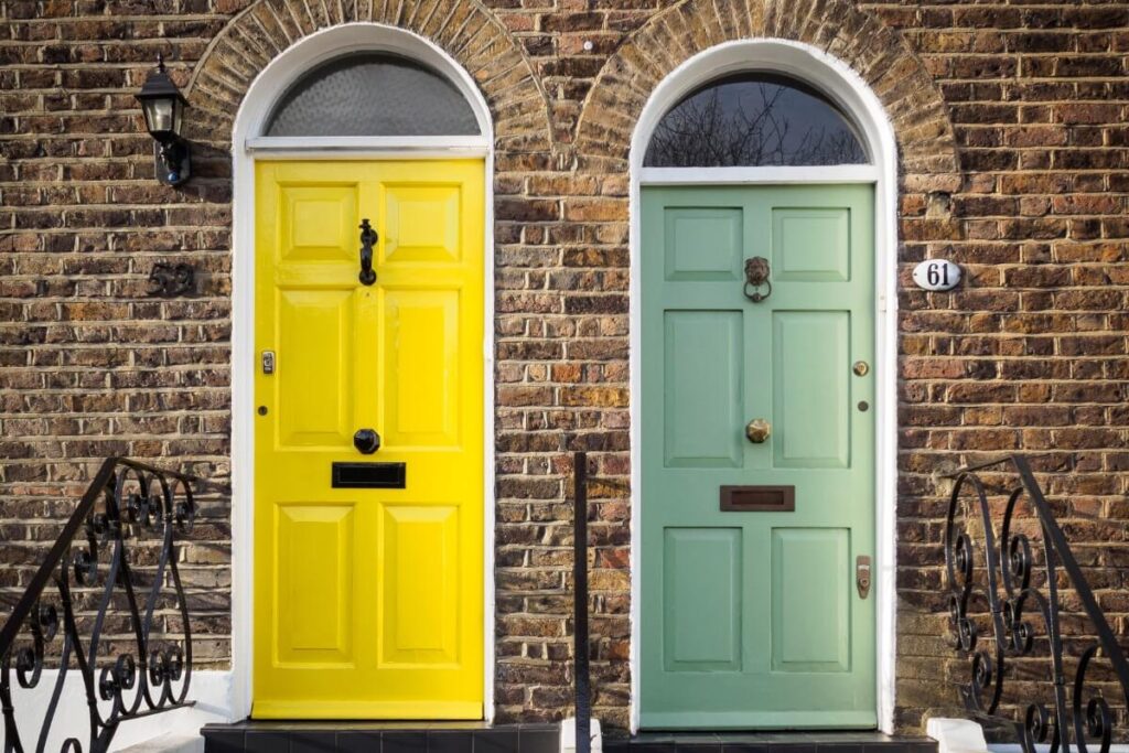
Let the Brickwork Guide You
Once you have a sense of the overall style, look closely at your exterior finishes. The brickwork, stone, or render surrounding the door is your permanent backdrop, and the door colour should complement rather than clash with it. Red brick, which dominates much of Britain’s housing stock, pairs particularly well with navy, black, dark green, or soft grey. Yellow or London stock brick — common across the capital and the south-east — suits muted greens, charcoal, and deep blue. Rendered or white-painted façades offer the most freedom; almost any colour works, and bold tones truly shine against a neutral surround. Darker brick or stone benefits from lighter or warmer door colours that create visual contrast and lift the entrance. One important rule of thumb: avoid matching the door too closely to the surrounding material. It is the contrast between door and wall that gives a frontage its character, not the uniformity.
Factor in Natural Light and Orientation
Here is a detail many homeowners overlook. The direction your front door faces — and how much natural light it receives — will dramatically change the way colour reads throughout the day. North-facing doors sit in cooler, bluer light for much of the year, so warmer tones help prevent the entrance from looking flat or unwelcoming. South-facing doors enjoy generous sunlight, which means cooler shades — deep blues, greys, and greens — tend to look their best. Shaded entrances, whether from a porch overhang or nearby trees, benefit from mid-to-dark colours that hold their depth even in low light. The only way to know for certain is to test. Paint a sample swatch on the door itself, or hold a large painted card against it, and observe how the colour shifts from morning to afternoon and into the evening. Five minutes of testing now can save a weekend of repainting later.
Experienced front door painters will often advise clients to live with a sample for a full day before committing, and that advice is well worth heeding.
Think About What You Want the Door to Say
Colour communicates before anyone knocks. Black and charcoal convey timelessness, confidence, and a sense of premium quality — there is a reason Number 10 Downing Street has kept its famous black door for generations. Navy reads as elegant, calm, and dependable, making it one of the most universally flattering choices for British homes. Green, particularly in its darker shades, feels welcoming, grounded, and quietly architectural. Red and burgundy are bolder propositions — traditional, statement-making, and full of personality. Soft neutrals, from pale grey to warm taupe, signal a more understated, modern sensibility that lets the rest of the property do the talking. Ask yourself honestly: do you want the door to blend in with the façade, or do you want it to stand out as a focal point? Neither answer is wrong, but being clear about your intention will narrow the options considerably.
Choose for the Long Term, Not the Trend
It is tempting to follow whatever shade the interiors magazines are championing this season, but repainting a front door is not a task most people want to repeat every year or two. Choose a colour you will still appreciate in five to ten years. Dark, classic tones — navy, black, deep green — tend to age gracefully and have the practical advantage of hiding scuffs, fingerprints, and everyday wear far better than paler shades. A gloss or satin finish will enhance the depth of the colour while providing a more durable, weather-resistant surface that holds up well through British winters.
Match Your Door Furniture and Details
Finally, do not forget the finishing details. Handles, knockers, letterboxes, and house numbers all need to sit comfortably alongside your chosen colour. Brass hardware carries a warm, traditional feel and works beautifully with dark blues, greens, and black. Chrome or stainless steel suits greys and modern palettes, lending a sharper, more contemporary edge. Black ironmongery creates strong contrast and looks especially striking on lighter-coloured doors. The hardware and the paint should feel like they belong together — mismatched details can undermine even the most carefully chosen shade.
If you find yourself paralysed by choice, take comfort in a reliable truth that decorators and homeowners across the country have proved time and again: black, deep navy, or dark green almost never fail. They suit the vast majority of British homes, they weather well, and they carry a quiet authority that never goes out of fashion. Sometimes the smartest decision is the simplest one.

